Graphs and charts are a great way to convey complex information. But it is also easy to deliver information overload.
We asked a range of expert presenters for their hints and tips on using graphs and charts in presentations.
Types of Graphs
Although texts carry ideas among individuals, there is no replacement for the pictorial representations that exist right from the days men lived in caves. In order to standardise the communication, many types of graphs evolved in the man’s quest for quick, easy and precise representation of data. Graphs range from simple lines to complex cosmograms that even animate.
The below infographic will share some interesting information about different graph types:


1. Less is more
I think one of the big things is to make sure you are using the right kind of chart to display the story you want your data to tell. Also, less is more.
Charts are busy enough and any extra axis numbers, tick marks and such should be removed and the gridlines should be subtle colours that don’t overwhelm the image.
2. Highlight key data points
I am asked to do a lot of creative tinkering with charts, and one of the most requested items is to highlight particular data points on a line chart. An easy and effective way to do this is by assigning a unique graphic to selected data points.
To do this you simply have to insert the graphic (could also be a text box with a relevant symbol character or wingding) somewhere on the slide. Then cut the graphic item to the clipboard. Go into your chart and select the single data point you want to affect (make sure you have the single data point and not the data series selected) and paste the graphic.

Valary Oleinik
Now that data point will carry the unique appearance even as the chart figures change.
I use this in instances such as a stock price timeline where you want to highlight the price at a certain date or you want to highlight where a change occurred in a business and you want a visual marker to make a comparison of the effects prior to and after the change. I could work up a chart sample if you would like.
3. Simplify your slides
Many graphs can be simplified to make them easier to read.
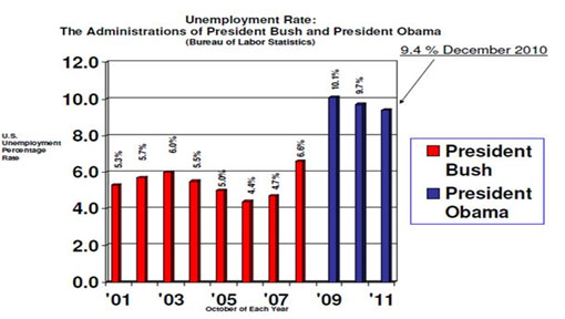
Take this example.

- Too much clutter, what I call mumblers and what Edward Tufte calls chartjunk. These mumblers are like the dense foliage in a jungle; you need to hack away at them with effort to work your way further into the jungle. Mumblers in this chart include horizontal lines, unnecessarily large numbers on the x- and y-axes, unnecessary detailed text.
- Large gaps between the columns. The rule of thumb is the bars should be TWICE as large as the gap.
- Sideways numbers above the bars, which are unnecessarily hard to read. In fact, you don’t need the y-axis at all if the bar values are included.
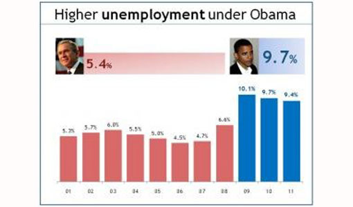
- No pictures. Whenever possible, try to convert your graphs into concrete pictures. Adding a pictures of Bush and Obama can replace the legend.
Here is an example of how this slide can be improved.


Bruce Gabrielle
4. Pie charts are not always easy to understand
Use the correct graph to display data. Pie charts are generally poor because viewers cannot quickly understand relative sizes of pie slices. Horizontal bar charts, sorted from high to low, communicate more clearly and are easier for the reader to scan quickly.
Both have their place, depending on what the audience needs.
Bruce Gabrielle – author, Speaking PowerPoint – www.speakingppt.com
5. Create better-looking graphs in PowerPoint 2010
PowerPoint 2010 creates much better graphs than the standard graphs that you get with PowerPoint 2003.
Something we often do here if we are creating a PowerPoint 2003 presentation and the client does NOT need to edit the graphs themselves: we would create much better-looking graphs in PowerPoint 2010 and then copy them into the 2003 presentation as images. We know we are in the very fortunate position of having easy access to all versions of PowerPoint and this might not be possible for everyone.
6. Be careful of embedding sensitive data

Matt Roper
But there are more reasons for doing this than just more visually aesthetic graphs. Whatever version of PowerPoint you are using, it’s still a good idea to keep the editable graph separate from your main presentation.
We know of a horror story where a presentation was left behind after an event and the Excel files that linked to the graphs contained some very commercially sensitive information.
7. Convey data in other ways than PowerPoint
Very few people remember the numbers. Convey them in some other meaningful way.
I had a participant on a course recently who was talking about a number of people that had been taken out of poverty in recent years. The number is meaningless, because I wouldn’t remember and cannot comprehend the number of people.
When he paused for a moment and said “That’s the same as the population of America”, it was easily understandable and extremely memorable.
8. Use props to convey data
Use props – check out Hans Rosling at TED on population statistics. He uses boxes and models of cars, planes and flip flops.

Paul Hayden
I once used steel buckets and coins – for the effect of the noise. If you show your market share by tipping in a (proportional number of ) few coins and then show the size of the available market left by tipping in another proportional number, people will not remember the number, but they will remember how long that noise lasted and how much share is up for grabs.
9. Only present key information
Think of what it means to the audience, perhaps just some of the data is enough (e.g. top 3 or 5 instead of the whole chart)
10. Concentrate on trends and changes
Concentrate on trends and changes rather than numbers and data.
11. 3D graphs are hard to read
Avoid 3-d graphs as much as possible, they are hard to read.
12. Animate your graphs
Try to animate the data instead of showing everything at once (overwhelming). By animating I don’t mean the custom animation on the software, but show the data gradually, one bar at a time for comparisons, one year at a time on a line chart, one piece of the pie on pie charts.
It will be like storytelling your data and the audience will be able to keep up.
13. Take a look at data visualisation

Yolanthe Smit
I find graphs and charts usually rather boring unless they are on paper or a webpage so I can study them at my leisure.
We recently devoted an entire TEDxTheHague Salon to data visualisation and watched these great presentations:

